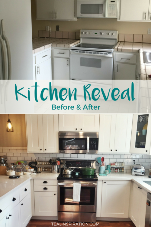
It’s been a long time coming and it’s finally time for our kitchen reveal!
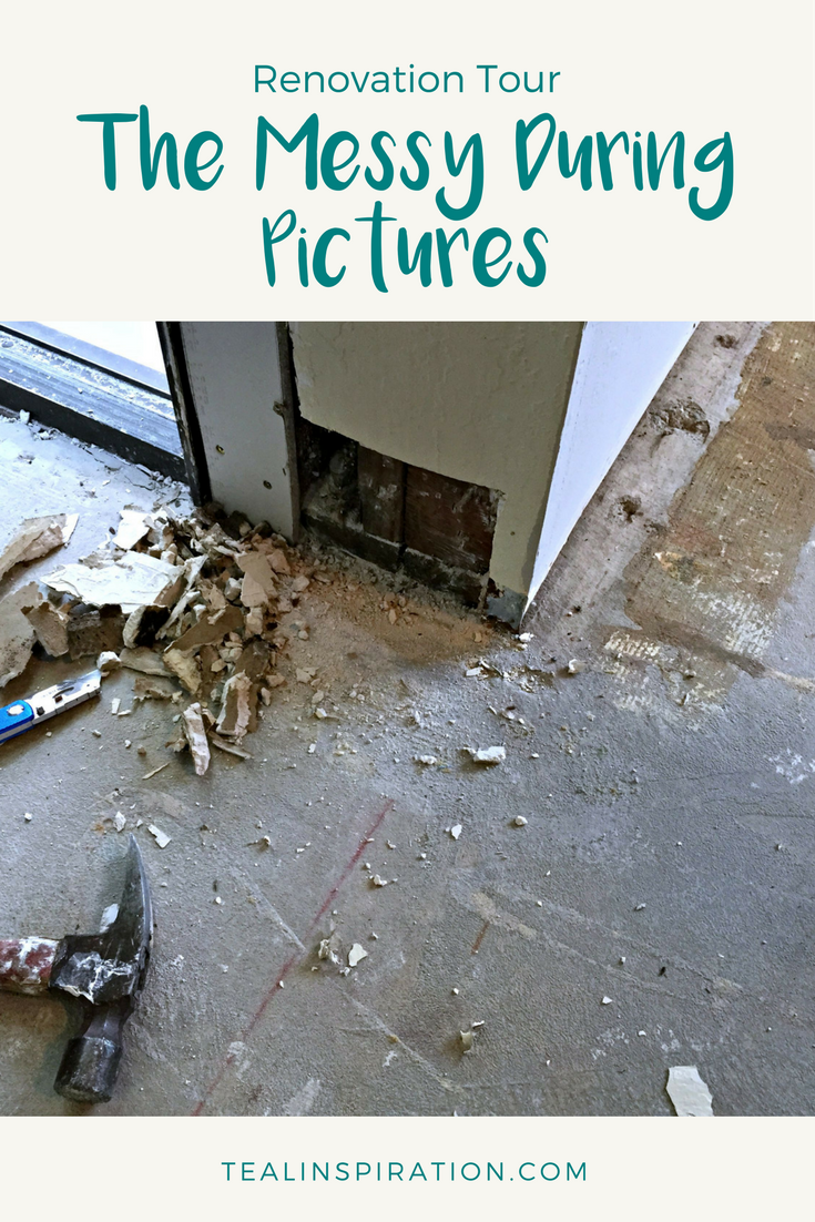
You can see all the before pictures here. If you want to see some really ugly pictures, check out The Messy Side of Renovation and my post about gutting the kitchen here.
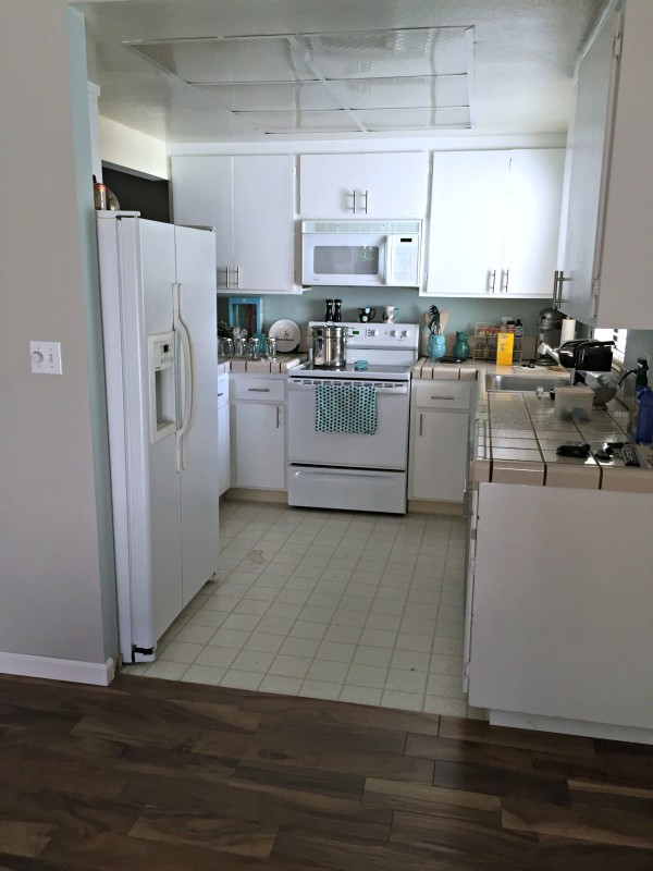
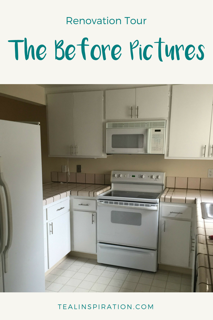
This is what the kitchen looked like before we started doing any work to it. We had left the linoleum in place instead of carrying the wood floor all the way through because we had originally planned to put tile in the kitchen area. We later decided to continue the hardwood through the kitchen as you can see in the after photo below.
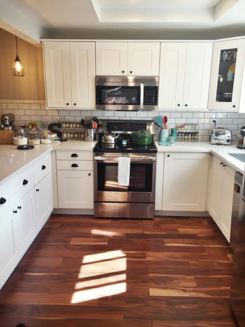
Here you can see the kitchen from the same view as the before photo above. I think that the wood flooring gives it a nice flow rather than breaking up the space. The cabinets, handles and knobs are from ikea. All the appliances are LG. We put in a white subway tile backsplash with dark gray grout for contrast.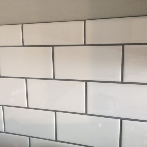
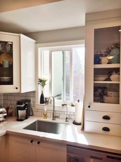
The cabinets were a lot more work to put together than we originally anticipated but it was worth it to get the completely custom sizes and look we wanted.
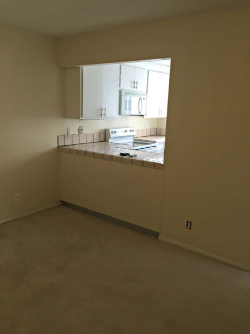
Here you can see the kitchen from the living room side before the renovation began. We opened up this wall and created a bar seating area that you can see in the photo below. The refrigerator was originally behind that wall space and we moved it to the other side to really open up the space even more.
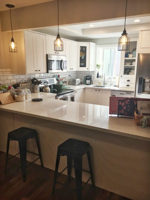
The lights above the counter are Edison LED bulbs fitted into authentic industrial wire light cages dipped in rubber.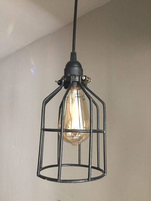
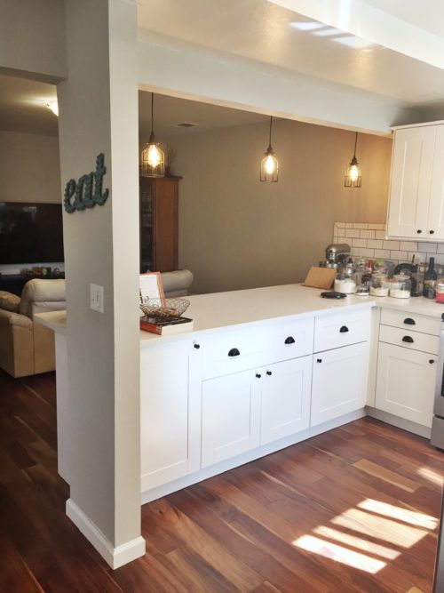
As you can see here, this is the other side of the counter, facing the living room from the kitchen. The small column of wall with the ‘eat’ sign is all that we kept from the side where the refrigerator used to be.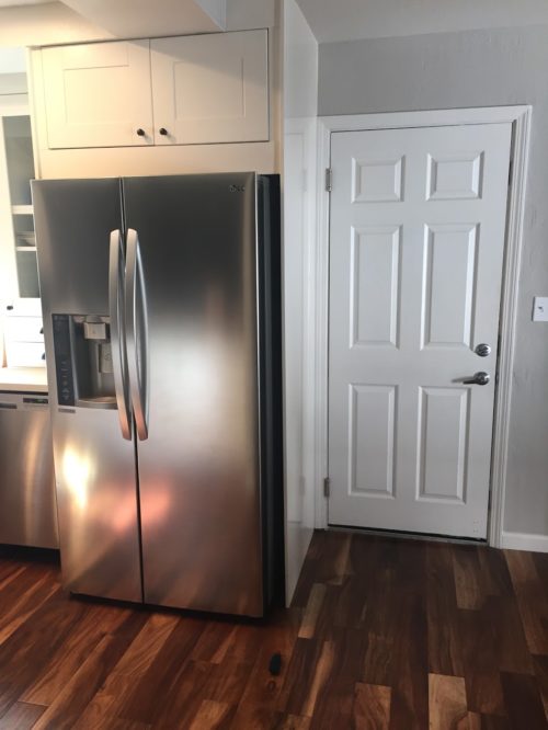
Having the fridge on the opposite side of the room makes much more sense. Here you can see how it is placed next to the door into the garage. We built out a cabinet to it doesn’t look as though it’s just sticking out right in the middle of the room.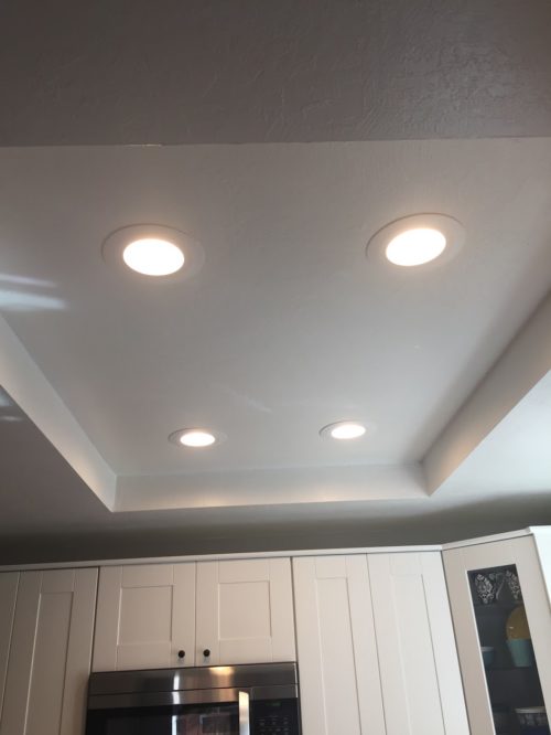
We also took out the old florescent lighting with the square plastic covering and put in recessed can lights instead.
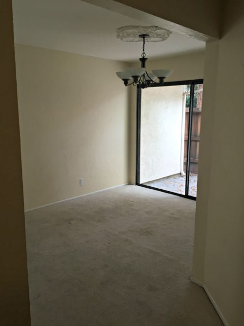 This is the dining area before, and the after photo from the same angle below.
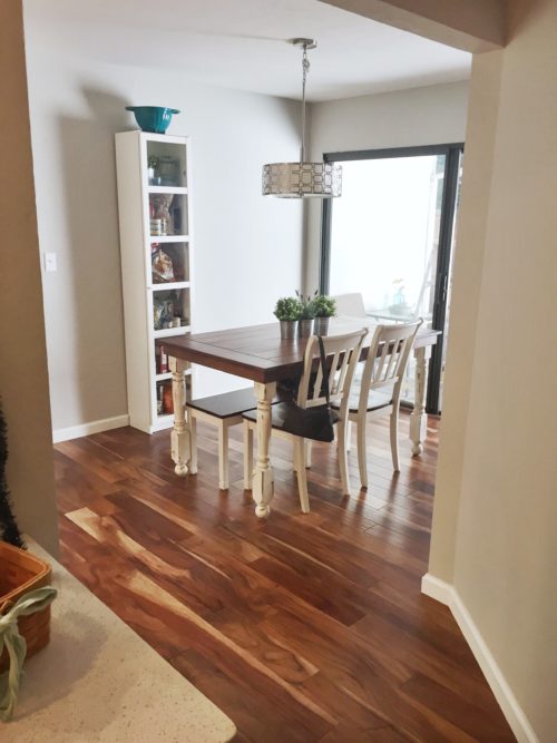 You can see more about our custom farm table here.
 Thanks for visiting!

