Actually, choosing paint colors happens to be one of my favorite things. Even when I’m not repainting a house, I enjoy looking at color schemes and what’s trending this season or year according to various sources. I could (and have) spent hours looking at paint chips and contemplating the possibilities.
When we decided to move, my very first thought was paint colors. I had a basic idea in mind. We wanted something transitional, a combination of contemporary and traditional styles. My husband wanted the main color to be gray but I was afraid that gray would be too harsh, make the house feel too cold and I didn’t want that. So, I did what most people these days do; I headed to Pinterest for some color inspiration!
I knew I wanted a warm gray, and I knew that the perfect color must exist somewhere, I just had to find it.
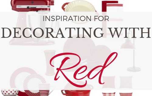
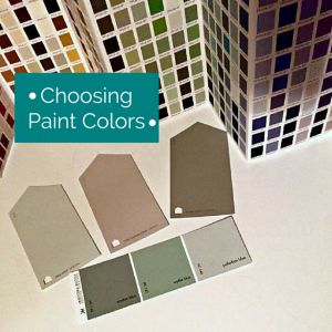
Usually, my go-to color would be a shade of green so I was really hoping to find a good grayed green. It turns out that any color you’re looking for, the pinners of the world have got you covered. I discovered a whole plethora of warm grays not to mention “the best greiges” (mix of gray and beige), blue grays with hints of green and even a perfect transitional color palette.
{Source}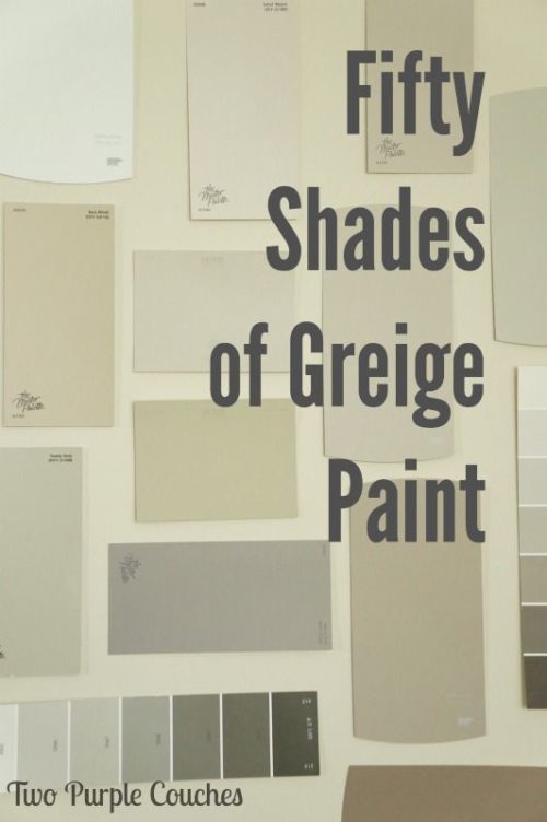
{Source}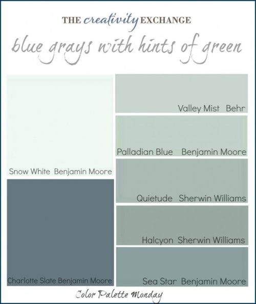
{Source}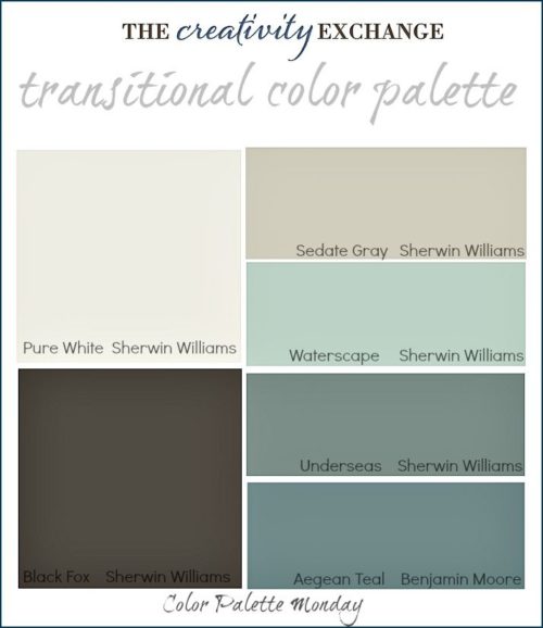
{Source}
Well, needless to say all of the excess of ideas I found on Pinterest was a little overwhelming. Even for a paint color enthusiast like me! But now I knew what I was looking for and could narrow it down (hopefully!)
I even found this Whole House Color Scheme and sort of fell in love with it. (i.e. saved the photo to my phone and gazed at it everyday for nearly a month)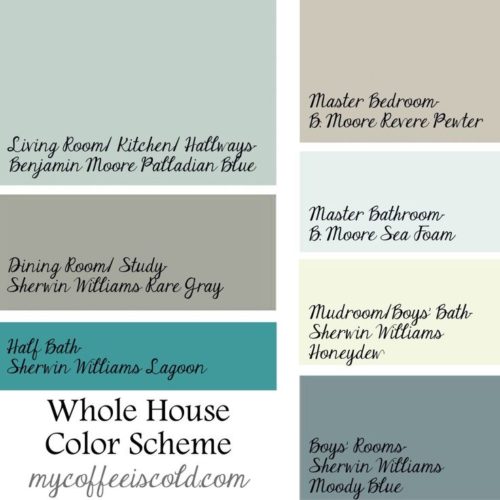
{Source}
I spent hours looking at swatches and blog posts and Pinterest boards and two colors kept popping up everywhere. Revere Pewter and Palladian Blue from Benjamin Moore. So I eventually gave in and went to the Benjamin Moore store and picked up the sample chips for myself. And then, finally some pint sized samples to try the colors out on the walls. Make sure to always try out your paint colors on the walls before you commit to a color because they look so much different once you actually get the paint on the wall than it looks on the chip or the screen!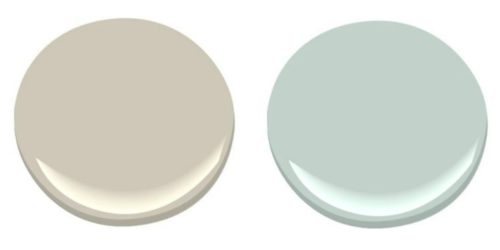
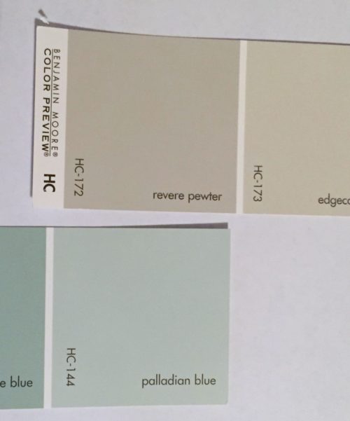
(My samples)
Revere Pewter has actually been described as “the best paint color ever.” And according to a design expert in Real Simple Magazine, “Because this neutral has hints of both taupe and gray, it will pick up the warmth of, say, hardwood floors or the coolness of zinc side tables.”
Palladian Blue is “a mix of blue, green, and gray- like an earth toned teal.” A design expert in Real Simple Magazine said, “A decorator classic, this pale blue-green is ideal for color-shy folks who want to push their boundaries a little.” And I’ve also read that it’s “said to be the most beautiful color as it changes with the angle of the light all day long. It is peaceful, flattering and not pastel. Its a grayed down, robin’s egg blue.”
After much deliberation and back and forth considering different brands, similar shades etc., these are the two colors I decided on. Along with Swiss Coffee for the trim and Off-White for the hallways and ceilings.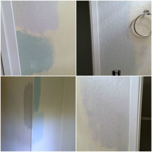
(Trying out some paint colors on the walls)
Here are some of the inspirational examples that I found which use Revere Pewter and/or Palladian Blue: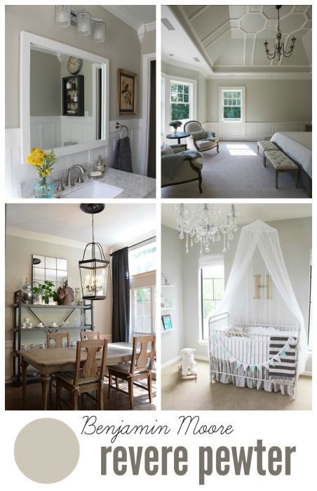
{Source}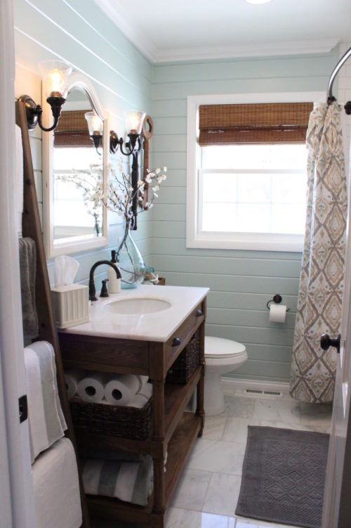
{Source}
I’ll have some pictures of our new place coming soon. Working on the “Before” and “During” at the moment!